

By TechNews Editor | Published in Innovation & Hardware
In the history of mobile operating systems, few platforms evoke as much nostalgia and technical respect as Windows Phone. Launched by Microsoft in 2010 to challenge the rising duopoly of iOS and Android, Windows Phone introduced a radical departure from traditional grid-based application icons.
While the platform ultimately lost the commercial smartphone wars, its underlying UI design principles, typography-centric layout, and low-level hardware optimization left a lasting impact on modern mobile software design.
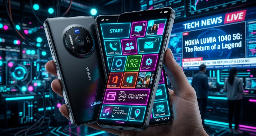
The Metro UI Revolution: Live Tiles and Typography
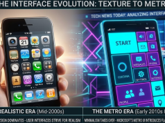
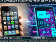
Prior to Windows Phone 7, mobile interfaces relied heavily on skeumorphic icons designed to look like real-world physical objects. Microsoft’s design team shattered this aesthetic by introducing the Metro UI design language (later known as Modern UI).
As detailed on Wikipedia’s Windows Phone history, the interface relied on distinct principles that set it apart:
- Live Tiles: Instead of static app icons, dynamic square tiles updated in real time with unread messages, weather updates, and social media notifications directly on the home screen.
- Typography and Content First: Metro UI prioritized clear typography and clean, flat visuals, moving away from glossy textures and bevels.
- Hub-Based Integration: The OS grouped related services into “Hubs” (such as People, Photos, and Games), allowing users to access updates across multiple social networks from a single screen.
Technical Excellence and Hardware Synergy
Windows Phone was celebrated for its smooth performance and battery efficiency, even on budget-tier hardware. While early Android smartphones required multi-core processors to overcome interface stuttering, Windows Phone maintained a locked 60 FPS animation rate using strict memory management and hardware-accelerated rendering.
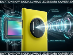
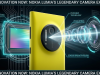
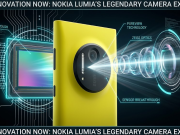
According to legacy technical archives from Microsoft Support, the partnership between Microsoft and Nokia produced iconic hardware like the Lumia 1020—a device that pioneered computational photography with its groundbreaking 41-megapixel PureView camera sensor.
Retrospectives published by tech outlets like The Verge continue to highlight how Nokia’s industrial design combined with Windows Phone created some of the most durable and visually striking devices of its era.
The App Gap and Ecosystem Challenges
Despite its slick user interface and passionate developer community, Windows Phone succumbed to what industry analysts call the “App Gap.”
Because Android and iOS already held dominant market shares, major software developers hesitated to build and maintain third-party apps for a third ecosystem. The absence of official apps for major platforms created a feedback loop that limited consumer adoption, leading Microsoft to officially discontinue active development of Windows 10 Mobile.
How Windows Phone Shaped Today’s Mobile Landscape
As explored in our ongoing UI and OS hardware analyses in Tech today, the design philosophies pioneered by Windows Phone live on. Apple’s introduction of home screen widgets in iOS and Android’s shift toward flat “Material You” design frameworks both draw direct inspiration from Metro UI’s original vision.
Though Windows Phone is no longer on store shelves, its bold UI innovations fundamentally reshaped how software designers build mobile interfaces today.