


By TechNews Editor | Published in Applications & Hardware
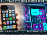
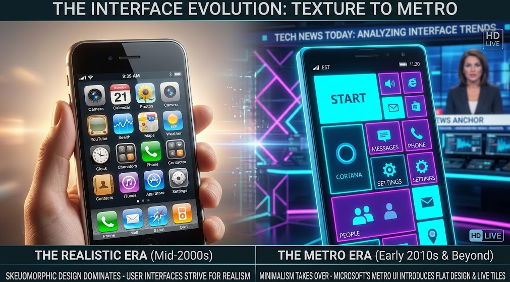
In the early days of smartphones, user interfaces were defined by skeuomorphism—a design approach that imitated real-world physical textures, such as leather stitching, glass reflections, and drop shadows, to help users transition into the digital age. However, as mobile adoption matured, these realistic textures became visual clutter that slowed down system performance and wasted screen real estate.
It was Windows Phone and its revolutionary Metro design language that broke away from this trend, proving to the technology industry that digital interfaces did not need to mimic physical objects to be intuitive.
The Birth of Authentic Digital Design
When Microsoft introduced Windows Phone 7, the core philosophy of Metro UI was built around the principle of being “Authentically Digital.” Instead of mimicking physical notebooks or real metallic buttons, the platform embraced typography, whitespace, and high-contrast flat colors.
As detailed on Wikipedia’s Flat Design overview, Windows Phone introduced key UI concepts that redefined software aesthetics:
- Content Over Chrome: Eliminating decorative borders, gradients, and artificial shadows to focus entirely on typography and readable content.
- Grid-Based Motion: Utilizing strict grid alignment with real-time animated Live Tiles that conveyed information dynamically without requiring users to open apps.
- Swiss Design Influence: Drawing inspiration from international typographic style (Swiss Design) and public transit signage for ultra-clear navigation.
The Domino Effect: Forcing Apple and Google to Pivot
The visual efficiency of Windows Phone sent shockwaves through Silicon Valley. While Windows Phone struggled to capture market share, both Apple and Google quickly recognized that skeuomorphism was obsolete.
UX design research published by the Nielsen Norman Group highlights how flat interfaces streamlined visual scanning and improved screen responsiveness across all digital platforms.
- Apple’s iOS 7 Redesign: In 2013, Apple stripped away drop shadows, glossy buttons, and felt textures, launching a flat, vibrant interface that directly reflected Metro’s minimalist philosophy.
- Google’s Material Design: Google evolved flat principles by introducing Material Design, adding subtle depth layers and responsive animations to raw flat shapes.
Design system guidelines maintained by Microsoft Design continue to emphasize how Metro laid the groundwork for modern WinUI and cross-platform design standards.
The Trade-Offs of Extreme Minimalism
While Flat Design revolutionized modern computing, early implementations faced usability challenges. Completely removing shadows and borders sometimes created “click uncertainty,” where users found it difficult to distinguish interactive buttons from static text labels.
This feedback led to the creation of “Flat 2.0″—a refined design language used today that combines flat aesthetic efficiency with subtle elevation cues.
The Lasting UI Legacy
As explored in our ongoing application and UI breakdowns in Tech today, every sleek web portal, desktop UI, and mobile app on the market today owes a structural debt to Microsoft’s mobile experiment.
Windows Phone proved that mobile interfaces could be minimalist, fast, and visually expressive without relying on outdated physical metaphors—a design shift that continues to shape how we interact with technology today.